Plotting the age distribution of formula 1 drivers over time
Published
2024-02-15
In this post we’ll be looking at the stats of a morally grey sport which holds events in many countries with dodgy human rights records, governed by increasingly shady characters, with an untenable environmental impact. No, not that one1! The one British athletes are pretty good at!
I grew up watching Formula 1 on a Saturdays with my dad, then it changed channel, BMW made a car that looked like a walrus, and Michael Schumacher retired, so I lost interest. Then, like everyone else, Drive to Survive sucked me back in.
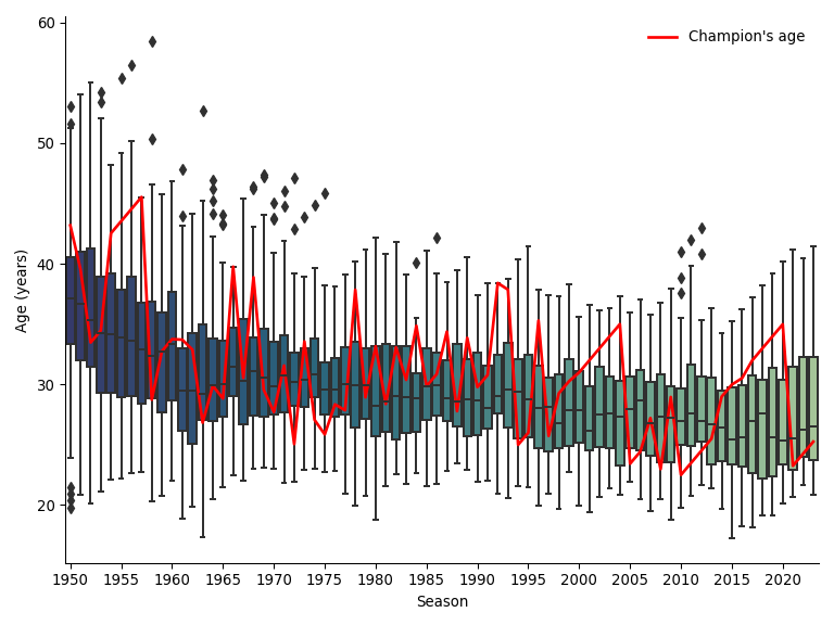
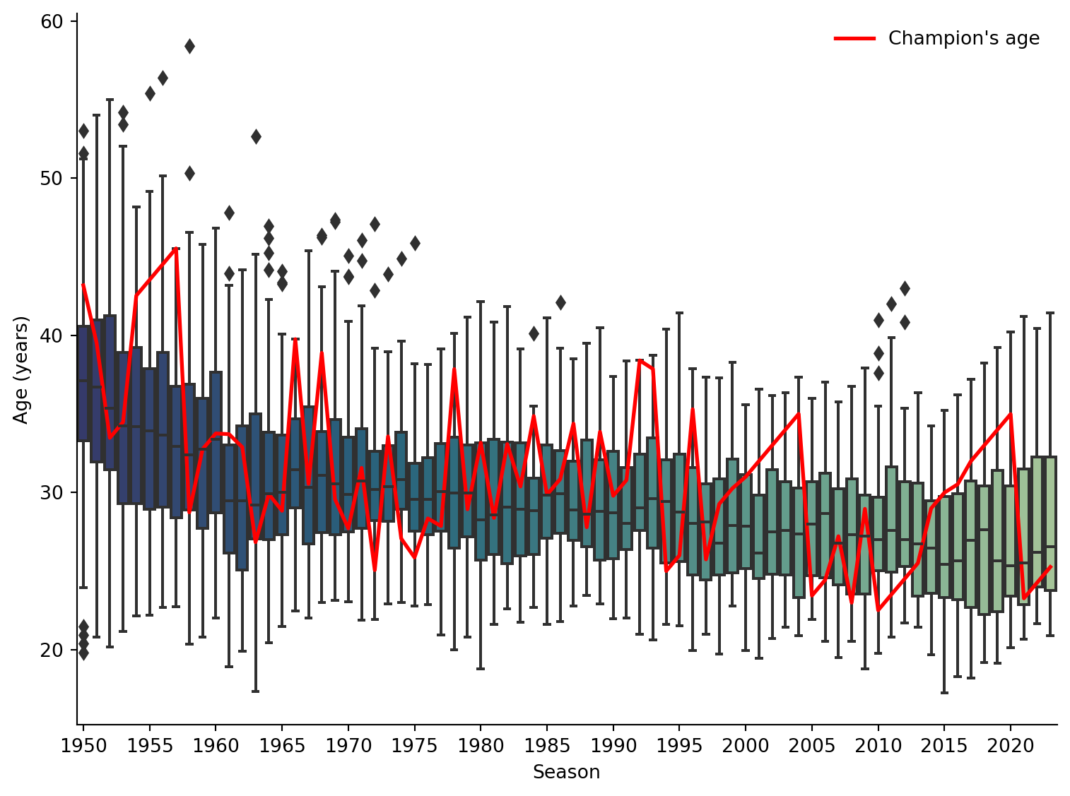
Then I started to wonder: am I just getting older or are the drivers younger than they used to be? The plot at the top shows the distribution of driver ages as a boxplot for each season, then the age of each champion as a red line. They have indeed got younger over time, though not as much as I had expected. It’s quite fun to see a period of a driver’s dominance where the red line is straight.
I’ll take you through how I made it, with a fun bonus chart at the end for anyone with the patience.
I went to wikipedia, pulled out the table of drivers, then followed the links to their individual pages and retrieved their dates of birth2.
Show the code
# This is the code for scraping the pages. I didn't want to bug wikipedia every time I render the page, so I've stored the output locallyimport requestsfrom bs4 import BeautifulSoupimport pandas as pdimport reurl ="https://en.wikipedia.org/wiki/List_of_Formula_One_drivers"response = requests.get(url)response.raise_for_status()soup = BeautifulSoup(response.content, 'html.parser')driver_table = soup.find_all('table')[2]rows = driver_table.find_all('tr')header = rows[0]row_titles = [cell.text.strip() for cell in header.find_all('th')]row_titles.append('Date of Birth')table_data =dict([(title, []) for title in row_titles])for row in rows[1:-1]:try: cells = row.find_all('td') name_cell = cells[0] name_link = name_cell.find('a') driver_name = name_cell.text.strip() driver_dob =0if name_link:try: driver_response = requests.get("https://en.wikipedia.org"+ name_link['href']) driver_response.raise_for_status() driver_soup = BeautifulSoup(driver_response.content, 'html.parser') driver_dob = driver_soup.find('span', class_ ='bday').get_text()exceptExceptionas e:print(f"Error getting details for {driver_name}") row_data = [*[cell.text.strip() for cell in cells], driver_dob]for i inrange(len(row_titles)):if i >len(cells): table_data[row_titles[i]].append('')else: table_data[row_titles[i]].append(row_data[i])except:print(f"Error parsing row {row}")driver_df = pd.DataFrame(table_data)driver_df.to_csv('data/f1_driver_data.csv')
Here’s the output for drivers with at least one championship
Show the code
import pandas as pdimport seaborn as snsimport matplotlib.pyplot as pltimport numpy as npfrom itables import showimport plotly.express as pxfrom matplotlib.lines import Line2Ddf = pd.read_csv('data/f1_driver_data.csv').drop(columns = ['Unnamed: 0', 'Race entries', 'Race starts', 'Pole positions', 'Race wins', 'Podiums', 'Fastest laps', 'Points[a]'])df['Driver name'] = df['Driver name'].str.replace('[\^~\*]', '', regex=True)df.set_index('Driver name', inplace=True)show(df.loc[df["Drivers' Championships"] !='0'])
A couple of the drivers didn’t have linked wikipedia pages, so I found their dates of birth and put them in. Now I can covert the birthdays to date stamps.
Show the code
df.loc['Erik Lundgren', 'Date of Birth'] ='1919-02-19'df.loc['Thomas Monarch', 'Date of Birth'] ='1945-09-03'df['Date of Birth'] = pd.to_datetime(df['Date of Birth'], format="%Y-%m-%d")
You may have noticed that the years they competed and won championships aren’t in a convenient format. I’ll make it so they’re a list of years (so 2015-2023 becomes [2015, 2016,…]).
Show the code
def parse_year_range(range_string):try: y_r = range_string.split(', ') years = []for y in y_r:if'–'in y: first_year, last_year = y.split('–') years.extend(list(range(int(first_year), int(last_year)+1)))else: years.append(int(y))return yearsexcept:print(range_string)return range_stringdf['Seasons competed'] = df['Seasons competed'].apply(parse_year_range)
I thought it would be fun to visualize each driver’s career, so I’ve reshaped the data so get their age each year so I can plot the age of each active driver as a line through the seasons. To make it a little easier to read, you can hover over the lines to see who’s who, though for some you might be able to guess!
Show the code
age_traces = pd.melt(df_race_years.drop(columns = ['Nationality', 'Date of Birth', 'Championships count', 'Championship years', 'Age']) .reset_index(), id_vars = ['Season', 'Driver name'], value_vars ='Age (years)' ).drop(columns ='variable').rename(columns = {'value': 'Age'})px.line( age_traces, x ='Season', y ='Age', color ='Driver name')
Footnotes
I know you can read the title and know which one I’m talking about, I just love a bit↩︎